Art Print FAQ
Fine Art Print Vs. Digital Print
When comparing matte fine art prints to digital prints there will be small noticeable differences in the colours and gradients. In this example, you can see less magenta shades in the clouds of the digital print (4 colours of toner) compared to the art print (11 colours of ink). Also the depth of the dark colours is less in the digital 
Matte or Glossy
Poster
Breathing Color Photo paper
- Glossy finish, coated smooth shiny surface
- Paper weight of 300gsm
- Optic White
- Vibrant color prints with with deep black
- Susceptible to fingerprints or bends; handle with care
Art Print (Fine Art)
Breathing Color Optica One
- Matte finish, textured surface with no glare
- Paper weight of 300gsm
- Bright white
- Hand cut edges
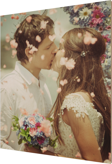
- Perfect for framing, for portraits and wedding photos
- Resistant to scratches and fingerprints
Art Print (Digital Print)
Mohawk Radian White Satin Paper
- Satin finish halfway between matte and glossy
- Paper weight of 352gsm
- 4 color print process using toner
- Cost effective & high definition print
- FSC Certified
- Machine cut edges
- Resistant to fingerprints and scuffing
Prints on Wood
Every Wood Print is Unique
Due to the natural properties of wood, every wood canvas will be unique. The wood grain is always different panel to panel.
Lighter colours in the artwork will be more transparent and show more grain through the ink than darker colours. Darker colours will be less opaque and show less grain.
White or No White?
Choose between printing the artwork with a white base or no white. Here's a bit about each:

No white
- Any white in the design will show as the wood grain
- Darker areas or areas of heavy detail will print darker than you see on your screen
- There will be a warm look to your print since the colour of the wood will give your colours a warmer tone. Blues in the artwork may take on a turqoise/green tint
- This setting is ideal for highlighting the difference between printing on wood and printing on paper. Printing on wood gives you a unique one-of-a-kind pieces each time since every wood canvas is different
Printing with White base
- White in the artwork will show as white on the wood canvas.
- A white base still allows the wood grain to be seen through by about 50%
- Ideal for photographs and detailed artwork